Foundation
Paper
Base ground#F4F1EAInk
Primary type#171514WILD CREATURE / Brand book
A practical kit for the site, print pages, social posts, emails and partner banners. Keep the proportions; let the image and the headline do the talking.
01 / Mark
The mark always uses Archivo: solid ink by default, then one animal marking on hover or keyboard focus—exactly as it does in the site header. For avatars, favicons and tiny spaces, use the compact stacked WILD CREATURE sign.
Interactive preview
WILD CREATURE02 / Palette
Ink and paper make the publication legible. An editorial accent marks a desk, a card, a rule or a single active element—never the entire room.
Foundation
#F4F1EA#171514Editorial accents
#EB6958#EDE166#C8A8CB#AED1C2#ADD0DF#5B304703 / Grids & type
Every format starts with a fixed outer margin, a modest gutter and one decisive alignment. The systems below are starting points, not cages.
Digital / 12 columns
64 px outer margin at 1440; 24 px gutters. Headlines span 5–6 columns, images span 5–7.
Print / 6 columns
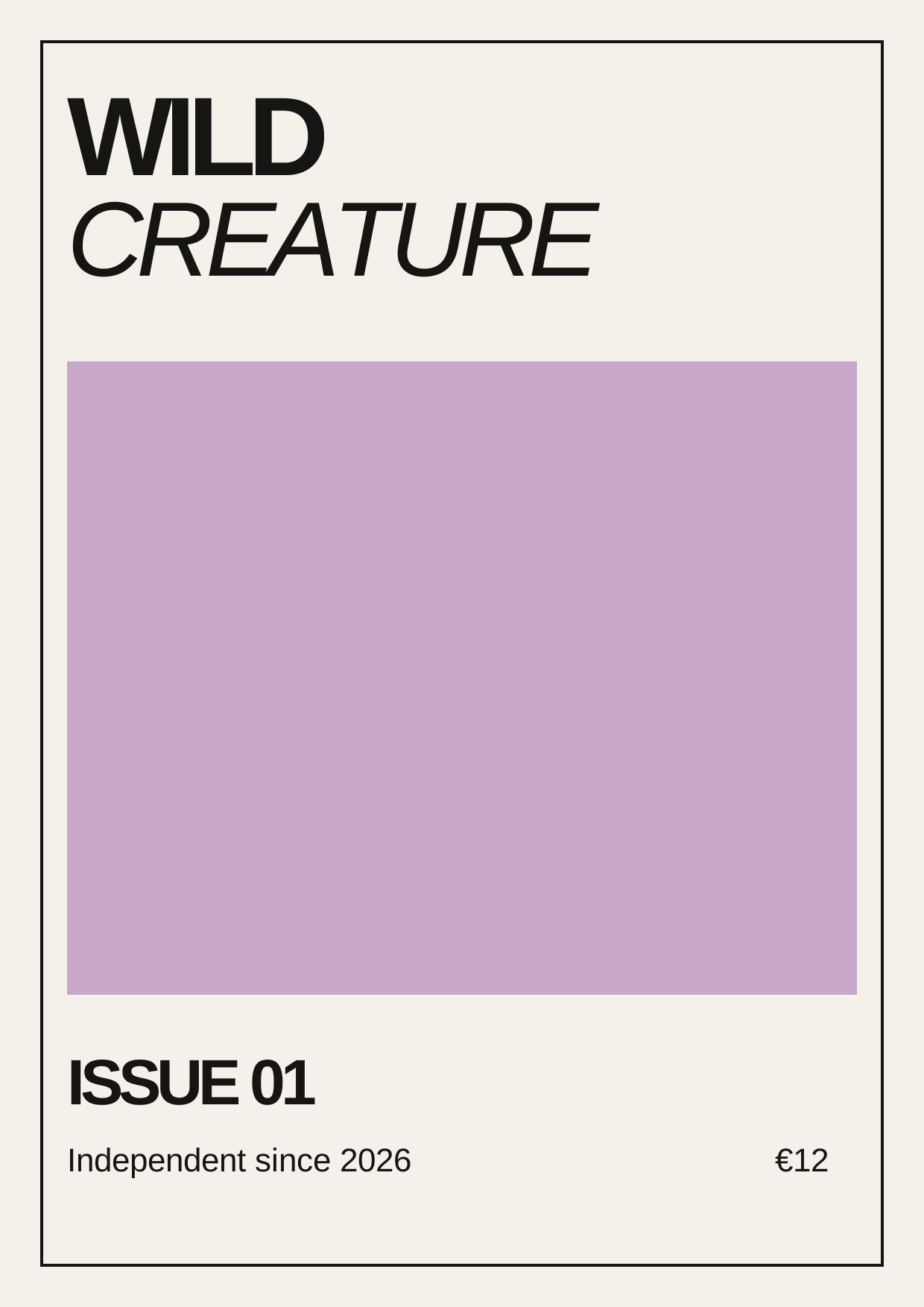
12 mm outer margin; 4 mm gutters. Use a two-column text measure and let photographs break the grid deliberately.
Social / safe area
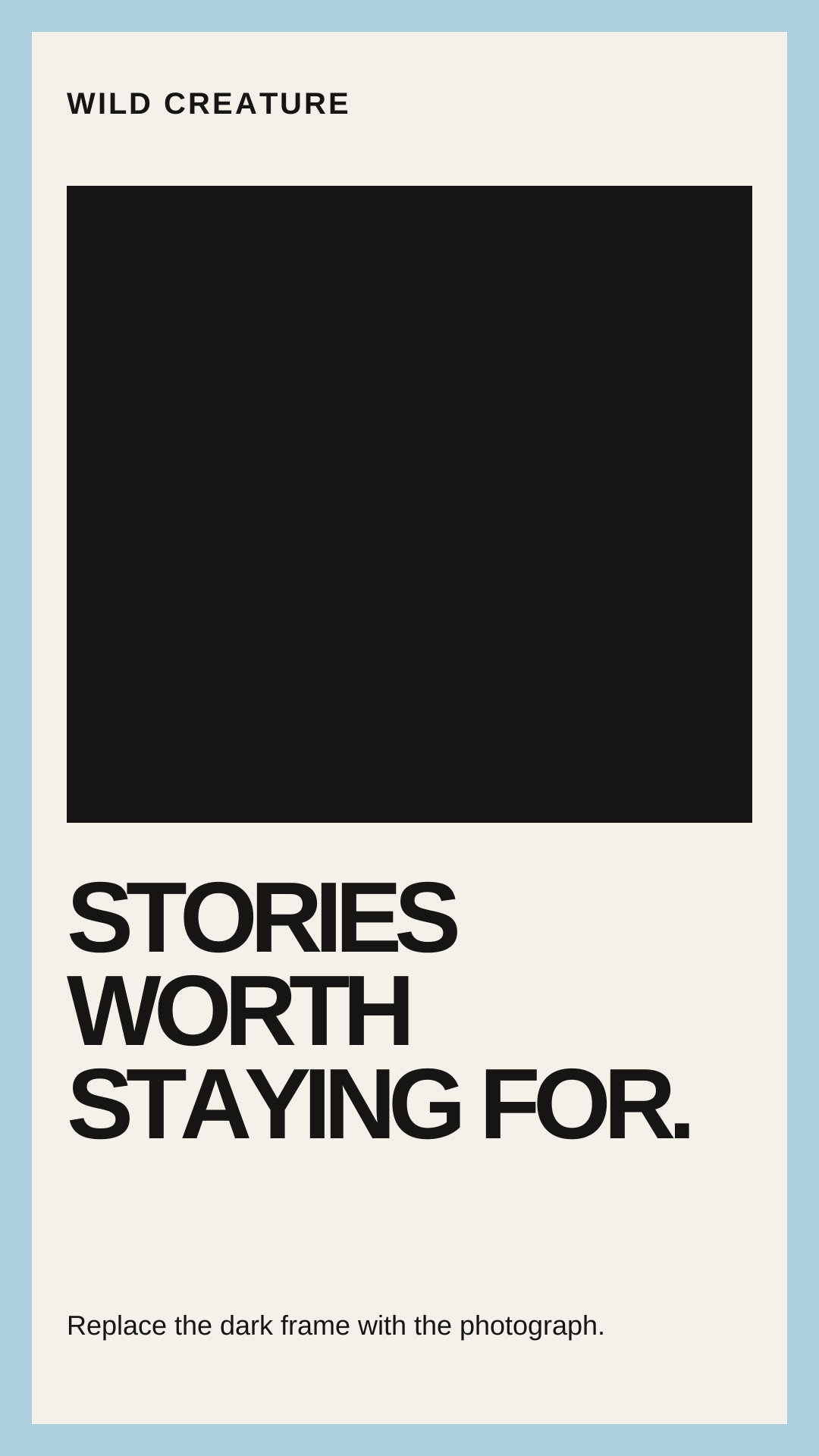
Keep live copy 8% inside each edge. Stories reserve the top and bottom 13% for platform furniture.
Display
ArchivoHeadlines, numbers and large editorial moments.
Weight 650 / tracking −0.055em / line-height 0.90Text
DM SansDecks, stories, captions, menus and service information.
Weight 400–700 / tracking 0 / line-height 1.45–1.7204 / Digital editorial
Article heroes use a two-part proportion. Cards keep their image ratios consistent, earn colour only on interaction, and use a single all-caps photography credit wherever a credit is supplied.
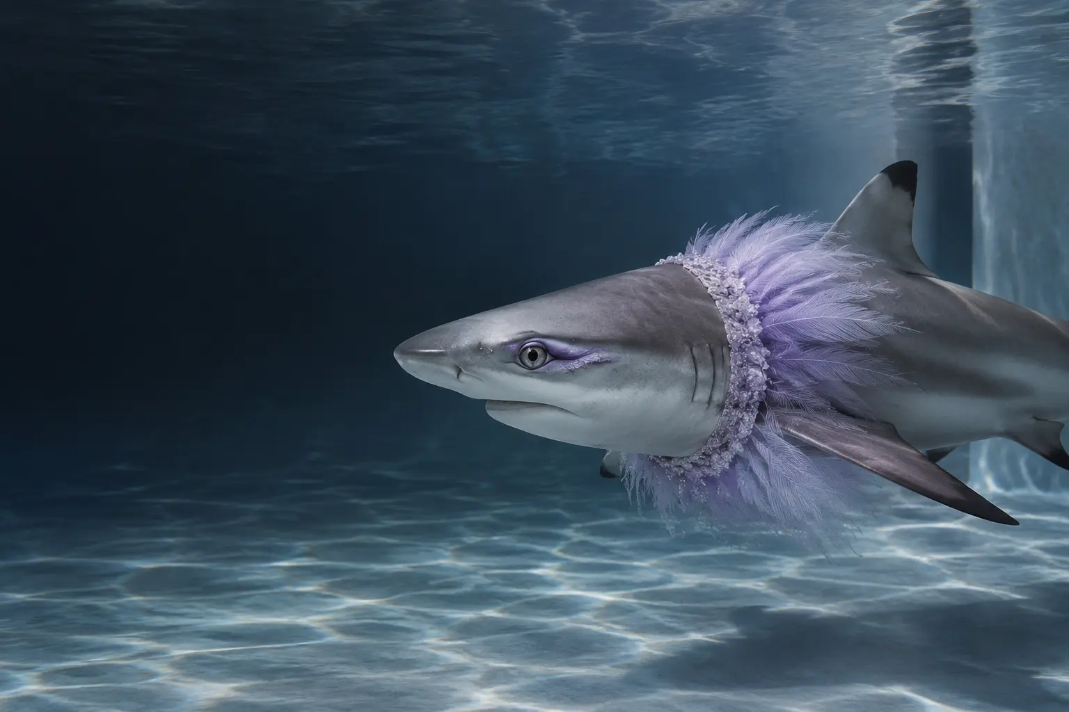 Photography by The Tidal Studio
The reef's most photographed face on beauty, privacy and learning to stop moving.
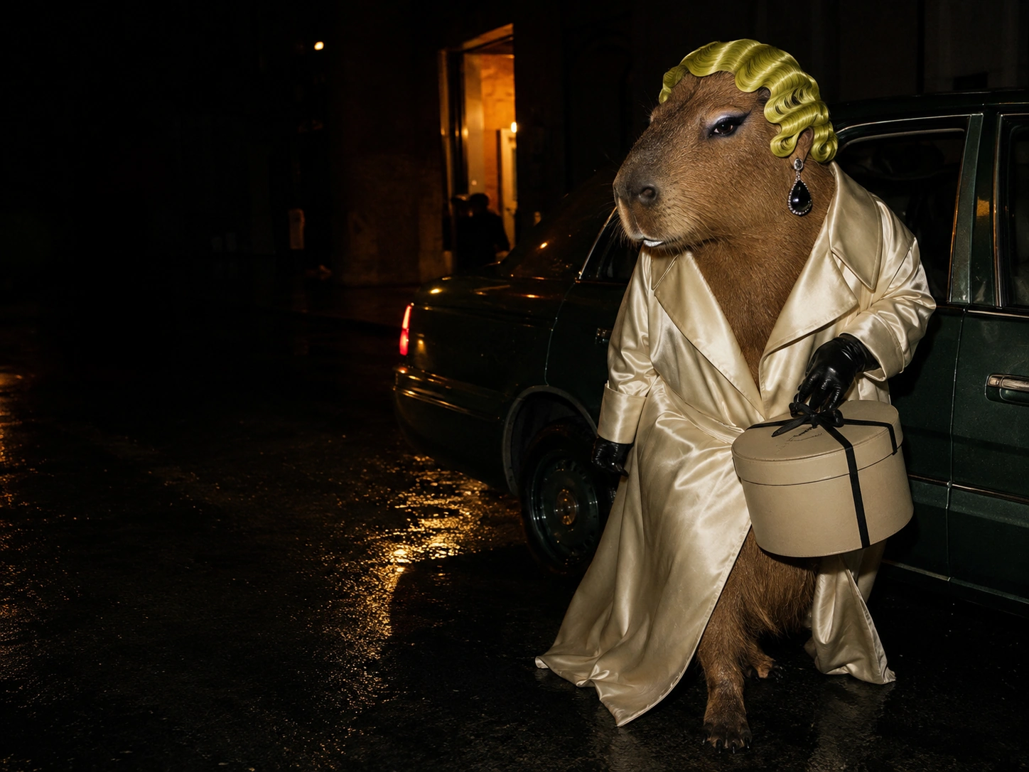 Photography by Basil Tern
The hatbox was sealed, the car was waiting and apparently nobody had been briefed.
Reading module
A wide single column carries the story. The editor stays useful at the edge, and a pull quote arrives midway—not as an interruption, but a change of current.
“The best line deserves a little air.”
06 / Print & banners
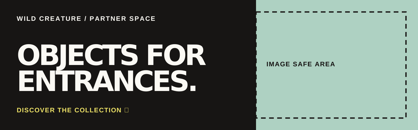
Print needs generous margins. Banners are whole-creatives links: one eligible banner is selected per placement on each page load, so a placement never becomes a stack.
07 / Downloads
SVG stays crisp in Figma, Illustrator, Canva and most browsers. Change the placeholder copy and image blocks; preserve the guides.




05 / Social & email
Same voice.
Closer crop.
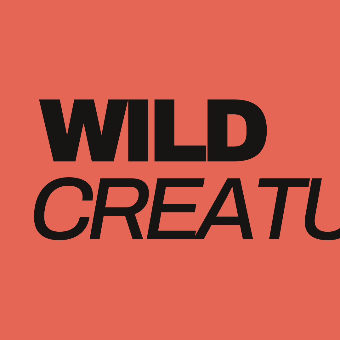
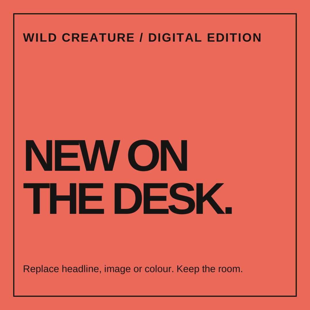
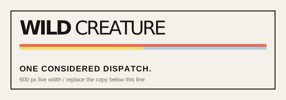
The on-page examples below are the actual downloadable files. They are intentionally simple: swap the image, headline and accent—never the underlying safe space.
The weekly current
One considered dispatch.
One image, one headline, one link. Keep email more useful than loud.
Read the story ↗